Responsive web design works on all internet-enabled devices
A responsive website is a must-have if you want your website to rank on Google’s new mobile index. Responsive sites adapt to desktop, tablet and mobile screen devices. Mobile phones have become the most popular digital device, followed closely by desktop computers; this is why getting a website that will scale to these screens and browsers is essential.
Mediatopia’s designers have been developing responsive and mobile-friendly websites since 2010 and have designed over 300 responsive websites since then!
Responsive web design allows your customers to view and interact with your business website on all mobile and tablet devices.
Responsive website design improves visitor conversions & mobile search results. They look good on all types of mobile & tablet devices – these websites are mobile-friendly!
Responsive Design
Mobile-First Index
User Experience
Our websites scale beautifully to different devices.
Mobile-friendly design adapts to different screen sizes


Responsive layout

Touch & Swipe

Easy Navigation

We are expert responsive web designers that know how to layout content across multiple devices.
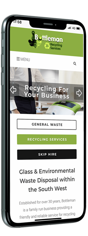

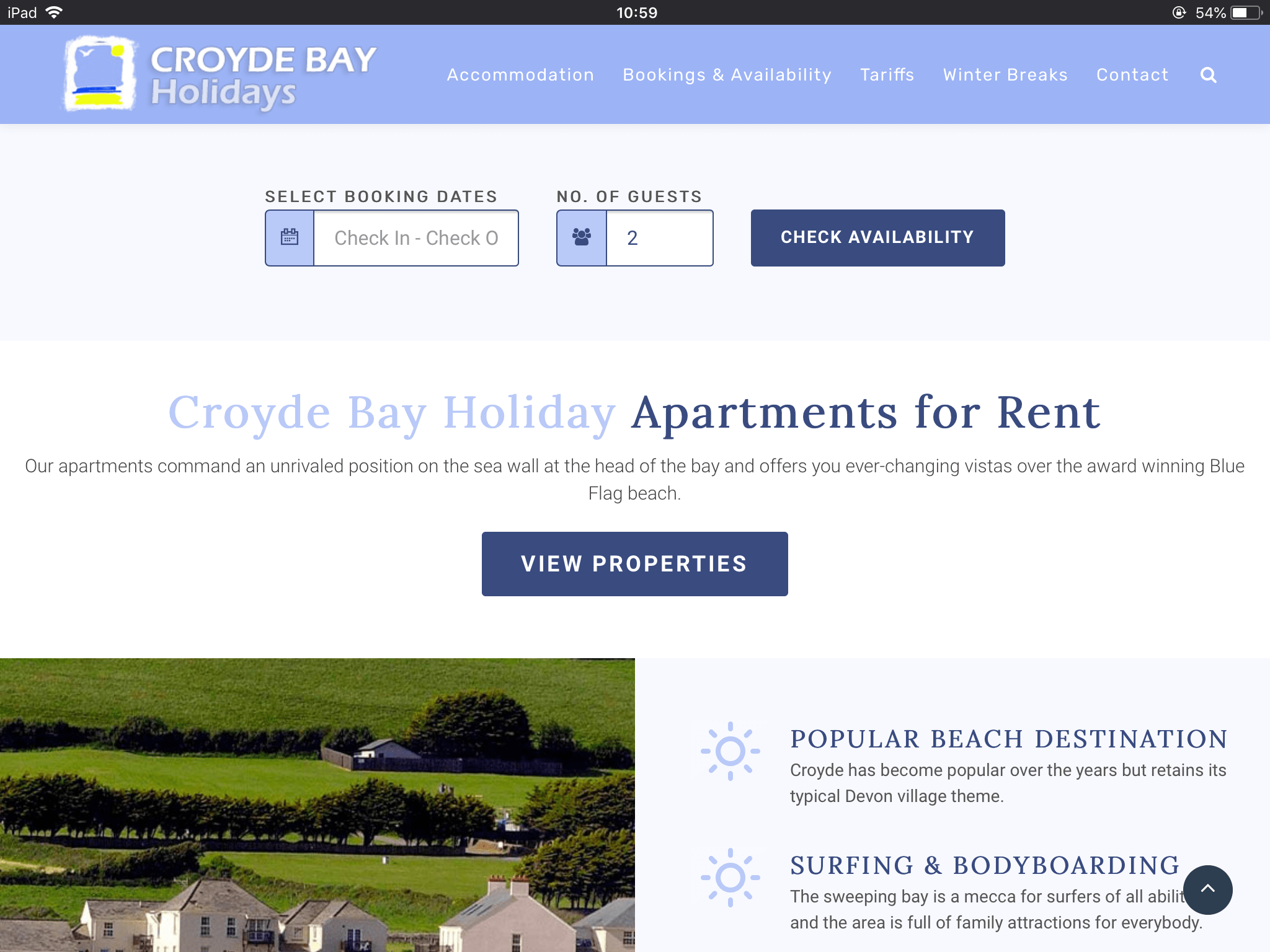
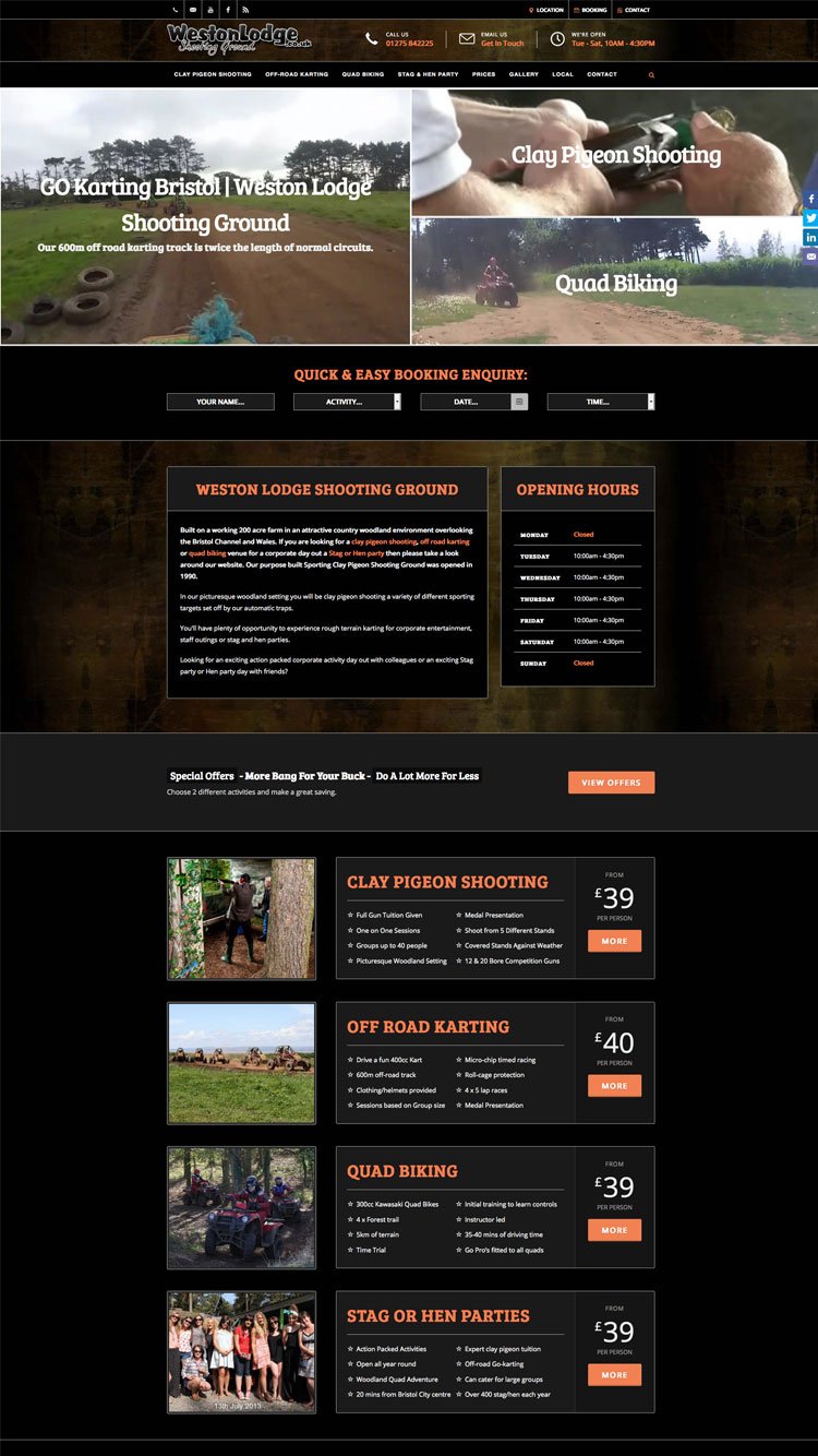
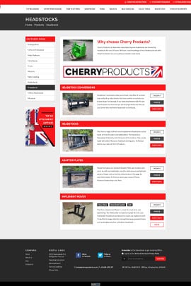
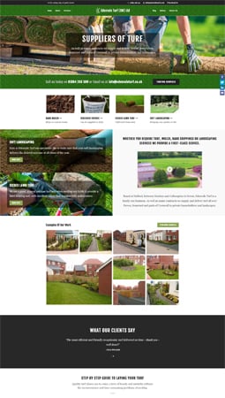
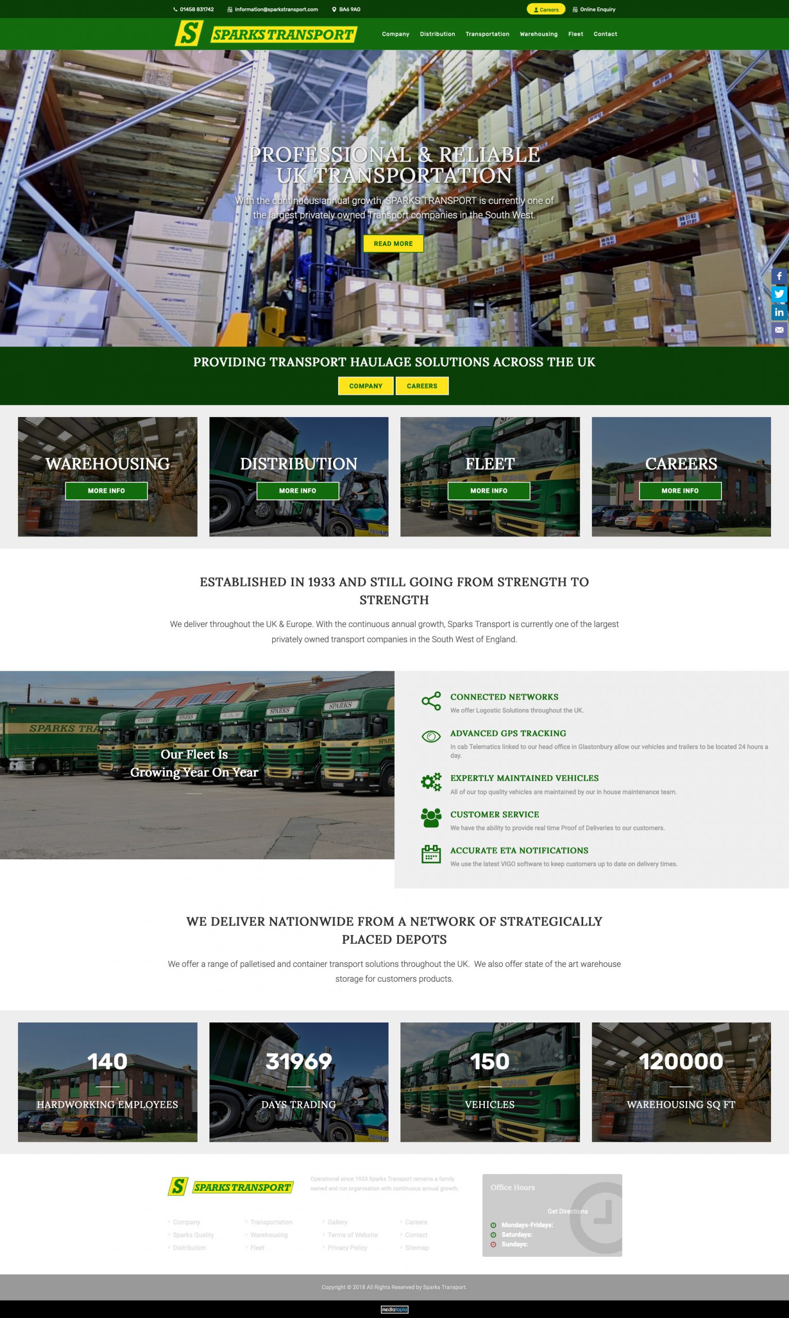
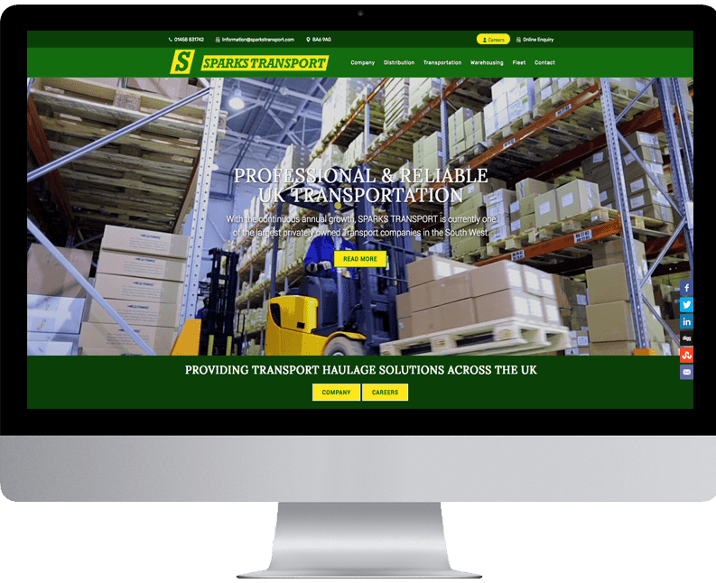
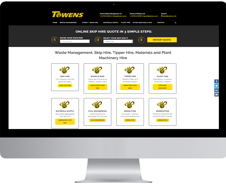
All of our responsive sites scale beautifully to different devices. Over 80% of the U.K population now use their mobile phones & tablets to browse and shop the internet and search for services using Google. If you are a business owner and have a website, the next logical step for you to take is to make your website responsive. Take a look at some of our responsive web design examples.
Responsive Layout
Conversion Rates
Improve Site Usability
Faster Page Speed
Lower Bounce Rate
No Duplicate Content

Are you a start-up business looking for your first professional website? Call us on 0117 332 6021
Are you looking for an affordable website package for your start-up business? Each site has enough functionality to give you exposure on the search engines and the necessary features to get online traffic making contact with your business.
Perfect for start-ups and beginners.
£100/month
£200 initial set-up fee
£150/month
£200 initial set-up fee
£170/month
£200 initial set-up fee
£225/month
£200 initial set-up fee
£250/month
£200 initial set-up fee
£500/month
£200 initial set-up fee
Monthly Rental
All our monthly rental websites have a 12-month minimum contract agreement
We host on our dedicated server, monitoring and supporting whilst you run your business.
With our starter site you can send in your content changes every 3 months.
With our professional site you can edit using the content mangement system.
Website Ownership
Once the website has been built, we will transfer all the files to you to set up on your own hosting.
We build your website on an open source platform. You can then host the website wherever you want.
All the images and written content on the website will become your property.
We offer our support and assistance should you need it in the future.
Answers to the questions people always ask!
Responsive design should cost more than a typical conventional site as more work is involved in creating one. Why? Because the site needs to be tweaked and developed for mobile and tablet devices. Usually, web designers create a website to work primarily on a 1920 x 1080 desktop screen resolution, which has recently changed to a laptop resolution of 1366 x 768. These resolutions get smaller on tablets and mobiles, and there are loads of these devices, so the website can look different. For example, you can have three nicely laid-out boxes that work perfectly on one screen and look different on a small device, or text can overlap if the title is too long. When creating a responsive site, all the design work must be checked and changed depending on the screen resolution, which can have a bearing on the cost of a responsive site. All that said, at Mediatopia, a standard responsive brochure site costs £1500.
Yes. If you have a website built many years ago, it is doubtful you have a mobile version of the site. Having a responsive website built will mean your business will get found on Google’s Mobile Index, which differs from the standard Google search. Your business will be found in multiple search engines and get more traffic.
We get asked this question a lot, and to answer it as simply as possible, if money is no option, then have a mobile site as it will be designed specifically for mobile. It will take longer as much more thought will be put into the designing and developing, especially if you want to manage it using a content management system. If you have a small budget, then responsive design all the way.
Code is added into the web file known to the non-layman as Media Queries, a feature of CSS3 (Cascading Style Sheets). When added with website HTML, these files show the end user, colours and styles on the page. These Media Queries allow content to change shape and render different screen resolutions. Even though this became standardised in 2012, Mediatopia used this technology as early as 2002!
Bootstrap is a CSS Framework. It comprises responsive and mobile-friendly widgets, code and web elements. Yes, Bootstrap is probably the best framework for responsive design as it will scale up to 12 columns allowing great creativity in the realms of responsive design.
This is a bit of an open-ended question. It depends if you are a developer or a non-techie average person. If you are ordinary, the best thing to do is contact a web developer or learn how to make your site responsive. Visit W3C Schools, and there will be a multitude of self-help courses that will give you the best ideas to make your site responsive.
Responsive web design looks great on all types of screen
More and more companies are progressing from conventionally built websites to mobile-friendly platforms.

It makes sense to think about your online strategy seriously, as the internet is evolving and technology for smart internet based devices is only going to increase.
57% of internet users will not recommend a business with a poorly designed website on mobile.
85% of adults think that a companies mobile website should be better than their desktop site.
Responsive websites rank higher on Google
A responsive website design built correctly will boost Google’s rank and enable your business more visibility on the search engines.
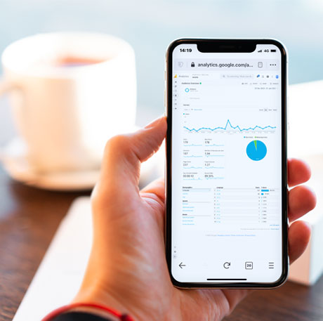
Is your site performing on Google's mobile index search engine?
39% of people will stop engaging with a website if it takes too long to load.
47% of users expect a website to load in 2 seconds or less.
Responsive websites make content management easier
If you had multiple sites for different web platforms, e.g., one for mobiles, one for tablets and built with various screen resolutions having to update, your websites must be a real chore! By having a responsive website, you can consolidate all of your websites into one design, making changing your content a breeze and having one website that looks great in all resolutions.